Sunday, October 12, 2014

Suburbia

For my object/space/building/place assignment, I focused on suburban houses. I originally wanted to do Italianate architecture, but then I remembered we had to focus on the 1950's to now (instead of yknow, the 1850s, in which case Italianate would have totally worked).
For details, I chose vinyl windows. They are crucial it seems to the contemporary suburban home. Economical and energy efficient, vinyl windows are a smart addition.
What suburban home is complete without some heavy, dark, La-Z-Boy furniture and Home Goods decor and beige walls?
This is a perfect example of a suburban home. Two car garage, vinyl siding, faux shutters, dormers, perfectly manicured green lawn, and a picture-perfect mailbox.
Another great example of a suburban street. American cars, wide streets for kids to play on, and houses that are all the same distance from the road. Classic!


Sunday, October 5, 2014

Palladio

Palladio influenced Western architecture by heavily borrowing from Ancient Rome. He was the first to make residential architecture draw upon religious architecture. Palladio also popularized the aesthetic of buildings with the same facade on each side, and he used columns for decoration instead of support.

Wednesday, October 1, 2014

Rose Window


Rose Window: pretty,
detailed, encapsulating,
colorful. Rose Window

Sunday, September 28, 2014

Columns

For my column compositions, I printed images that I thought showed how important and interesting columns are. Besides being an architectural detail, they are used as support. I also wanted to show the detailing in each, especially since there is such a range from simpler (Doric) to incredibly ornate (Corinthian).
Another detail I added was in the title, as each column name has an 'i' in it, I drew it to look similar to the column on that page.
I am also interested in exploring how the three columns have influenced the other columns and post that we see today. You can see similarities in many, but I will definitely be looking into it more.

[ no photo because I turned my compositions in ]

Wednesday, September 24, 2014

Klismos

The Klismos Chair is a perfect example of using texture and line to create a refreshing take on an everyday object. Take the legs, for example, the curved lines add an interesting component, allowing the chair to become unusual and thought-provoking. The back of the Klismos is comfortable and inviting, while the seat of it has an engaging texture, but the material allows for some give, improving the comfort of the, otherwise, all wood chair.

I personally am quite fond of this chair, I think it looks quite contemporary. I am curious to see what it would look like if it was done in lucite, or if it was upholstered; I think it would take on a completely different approach but still maintain its intrigue.

EDIT:
I found some examples of a lucite and upholstered version! Although I'm not a fan of the 'ghost chair' trend, I could get used to a ghost Klismos chair, and definitely prefer it to the upholstered one (which looks like a sad, too short dining room chair).


Tuesday, September 23, 2014

Rendering


My rendering was based on the principle unity. In the three buildings--Miller Hall, Whitehall, and R. G. Anderson, there was the overwhelming presence of brick and white-ish mortar. Two of the buildings (Miller and Anderson), featured large windows that allowed for a sufficient amount of light to come through. Although the buildings all look like they are from a different time period, they are unified through the brick, which I tried to show through my composition.

Tuesday, September 16, 2014

Mod


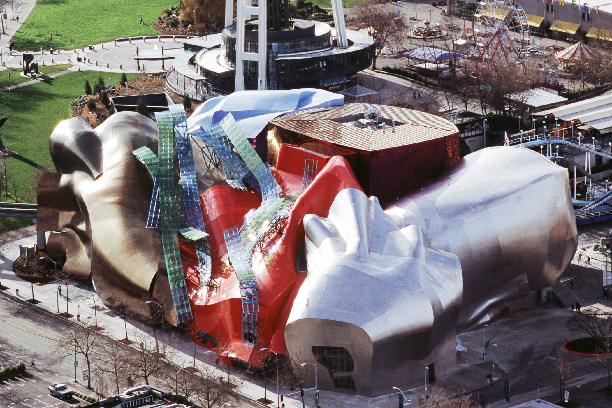
The Experience Music Project, or 'EMP', is located in the South Lake Union district of Seattle, WA. It was designed by Frank O. Gehry, and was constructed in 2001. It is composed of over 21,000 aluminum and stainless steel shingles, and 280 steel ribs. The space itself is about 140,000 total square feet, and it's tallest point is 85 feet high.

It was also the first constructed space that was designed using CATIA.